Keller Williams Office Interior Design
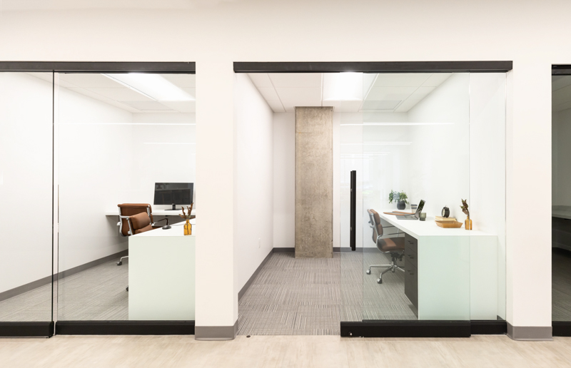
My husband has been working for Keller Williams for a few years now and it’s actually what brought us out to Arizona. During this time of covid, when weddings were postponed, I found myself doing very little work and for the entrepreneur/go-getter in me that was incredibly hard. But because of that when I was asked by Jim & Kristan, at Keller Williams Arizona, if I could help them design the space and outfit it I was actually able to say yes! Interior design has always been something I’ve been passionate about but I’ve only ever done it for myself and for my family and then answering a couple design questions for friends. So to start out on a commercial project of 6000 sq ft kind of felt like a big piece to chew on. But the thing that is different about commercial interior design vs designing a home is that function is the first and foremost idea BUT that doesn’t mean you need to compromise style.
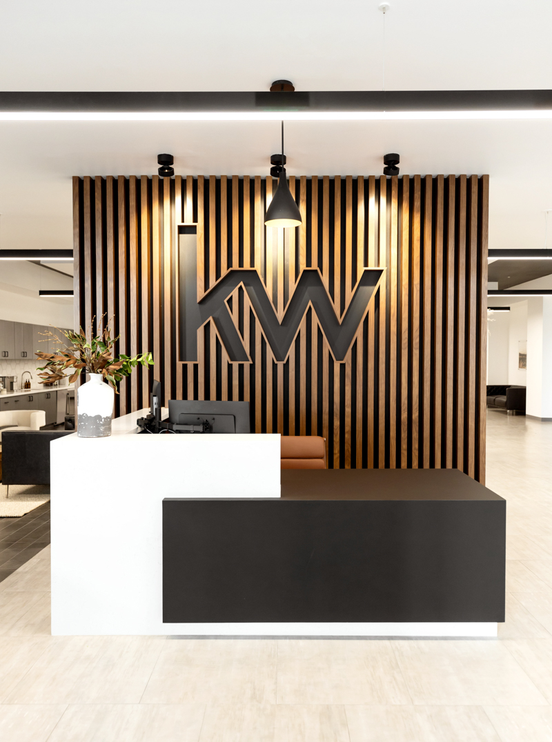
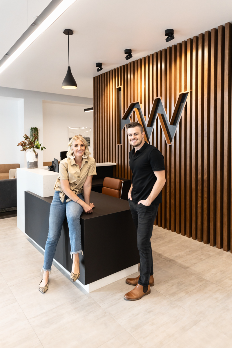
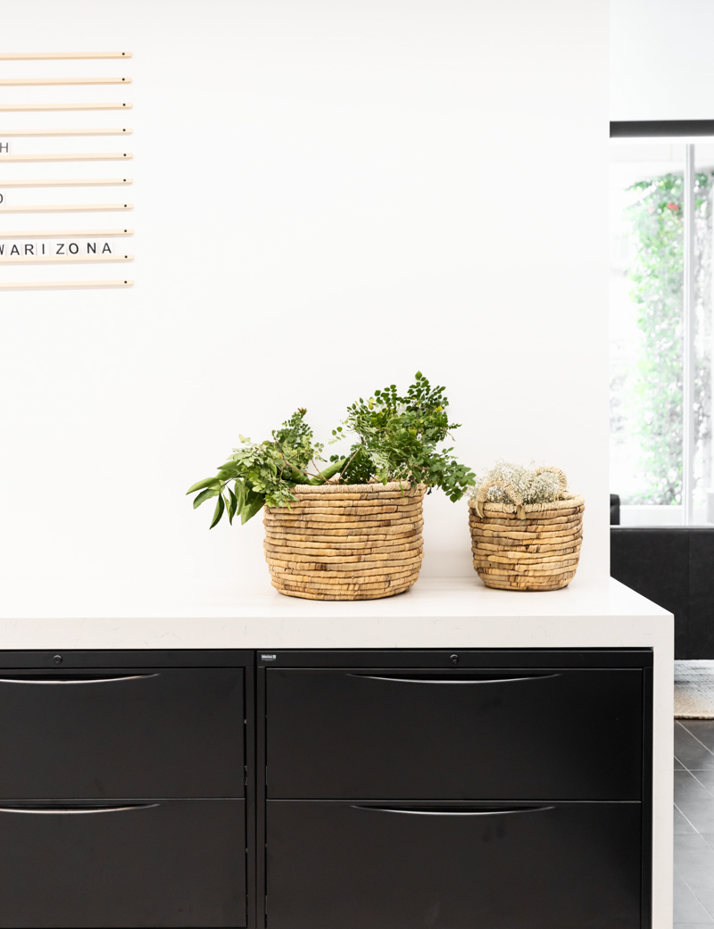
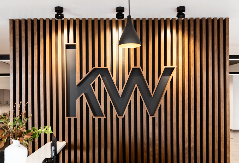
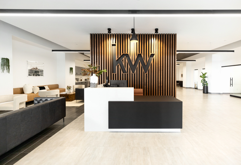
Keller Williams is a realty company and since this was one of their business centers and I knew realtors would be meeting their clients here, I wanted to make sure it felt warm and welcoming to their clients- giving them a taste of what it would be like to be in their new home. I incorporated that warmth first in the show-stopping front entrance sign- a slat wood wall with the KW logo cut out into it. I had researched and see many Keller Williams offices that just had the logo with it’s red and black letters planted on a white wall. I knew I wanted to do something different- something that still very much let you know where you were walking into but not something that had been replicated over and over.
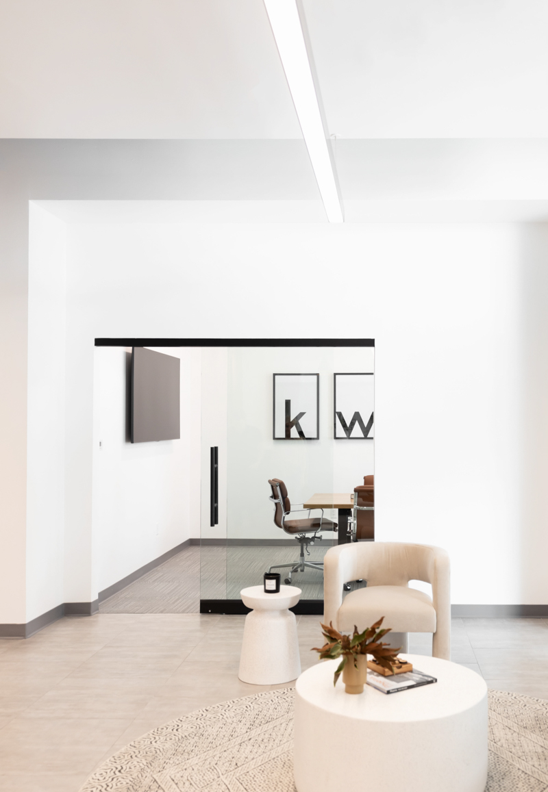
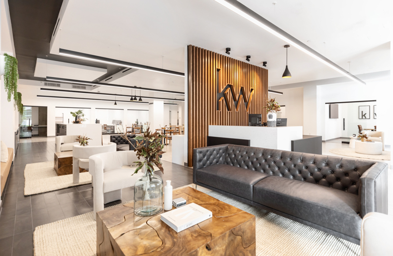
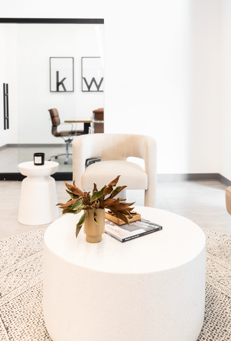
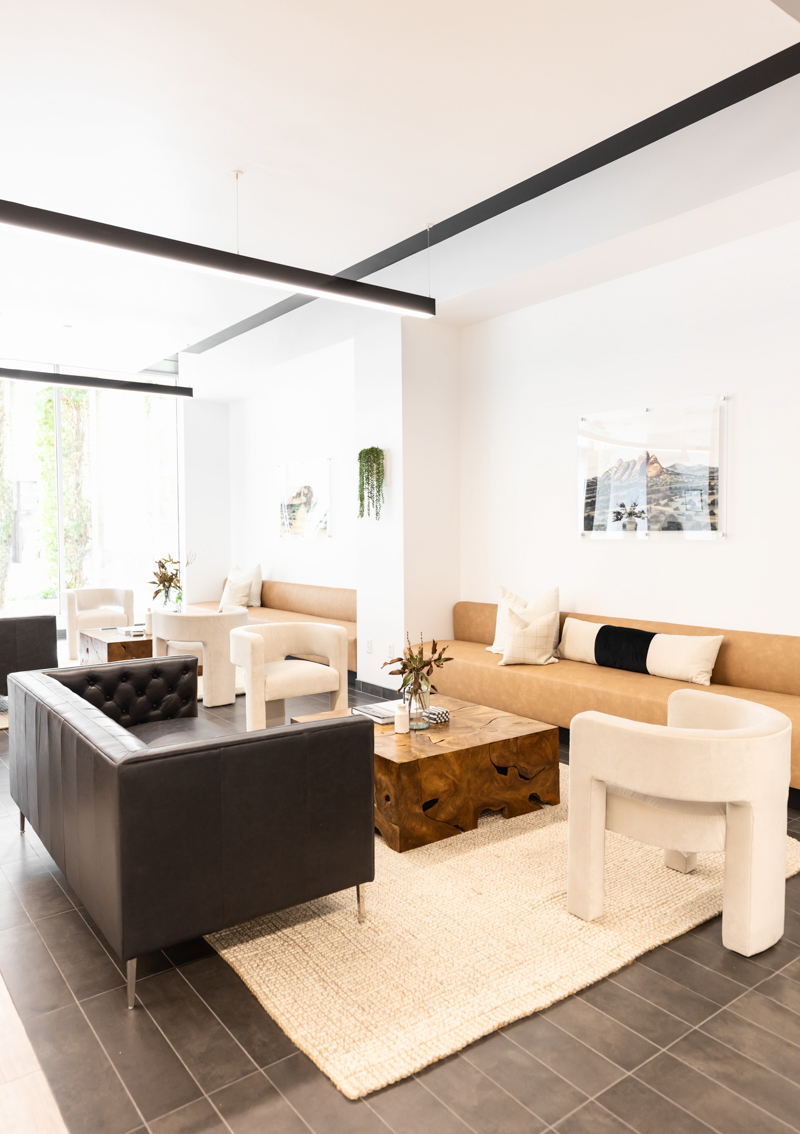
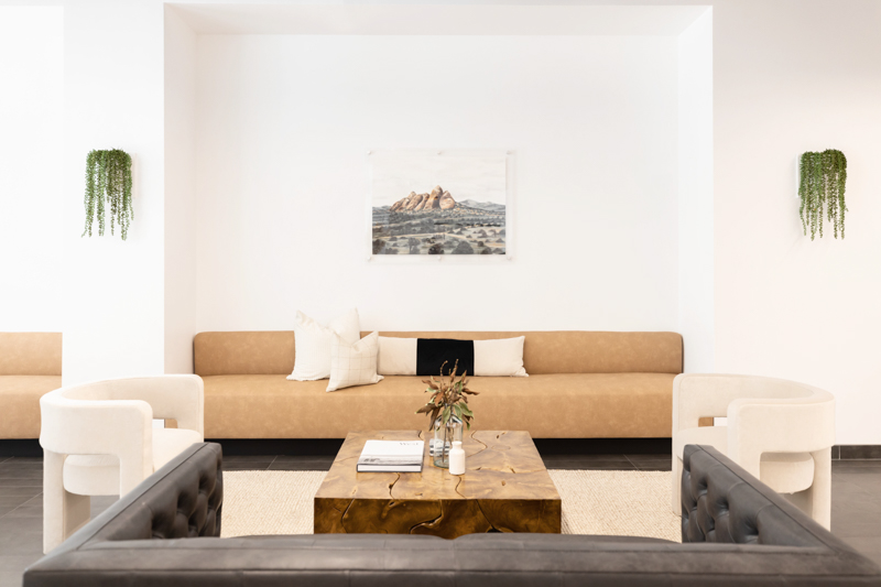
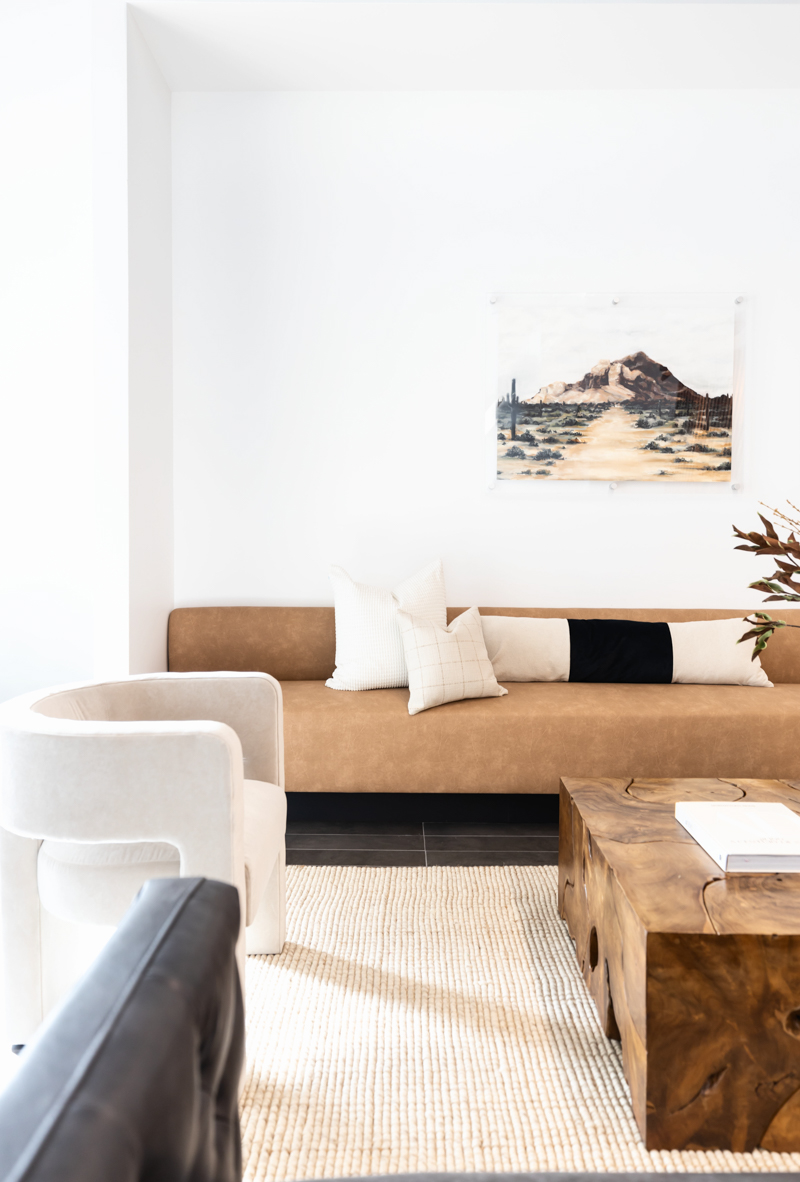
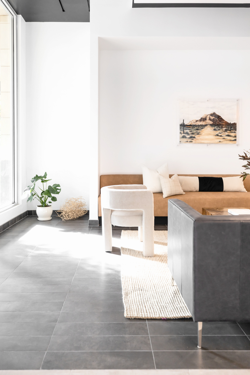
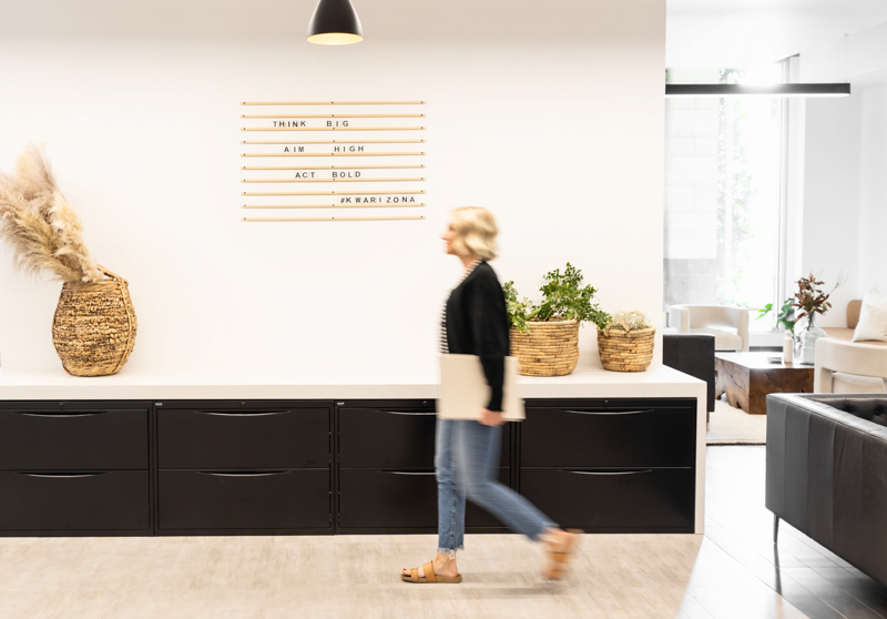
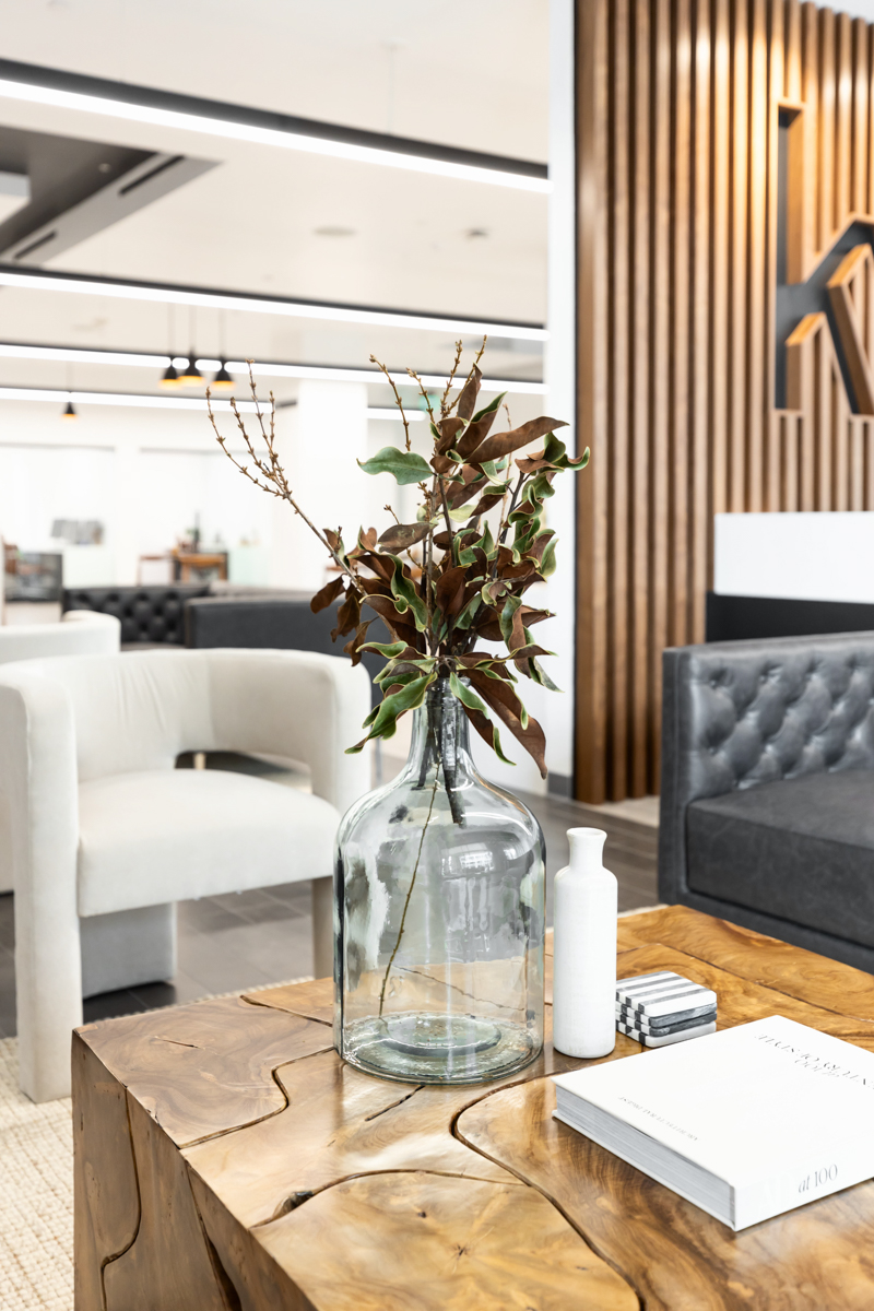
The sitting areas were important to me too. I wanted it to be comfortable, homey, functional, and with variety to make it unique. Over each sitting area is a custom painting of places in Phoenix created by artist Carson Kowar.
Such a fun project to work on. Thanks Keller Williams Arizona!
